Logos & Branding Guidelines
These guidelines have been developed to ensure the proper and consistent use of the official InterFlex Group name, logos, taglines, colors and fonts.
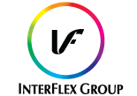
The logo guidelines cover all usage of the IFG brand including use on all printed material and electronic communication tools. The guidelines protect the integrity and help build a strong visual identity of the InterFlex Group brand.
Company Name
Our company name is InterFlex Group with a capital F in InterFlex. Do not use Inc. at the end of our name; we are not an incorporated entity.
Form & Display of the Logo
The approved logos shall be displayed only in the appropriate form, size and color, with no alterations to design or color scheme. A protective area around the logo is required and should be at least 1/8 of the height or vertical distance of the logo. Please remember to scale the logo image in equal vertical and horizontal proportions. Do not skew it to be wider or taller than its original proportions. To ensure legibility of the corporate name, approved logos must be larger than a 1/2 inch square for the vertical logo and a 1/4 inch in height for the horizontal logo.
Tagline
Our tagline is “Image is everything. Packaging defines it.” This can be used with or without our logo. The tagline should always include punctuation and should be used in either black or white text only.
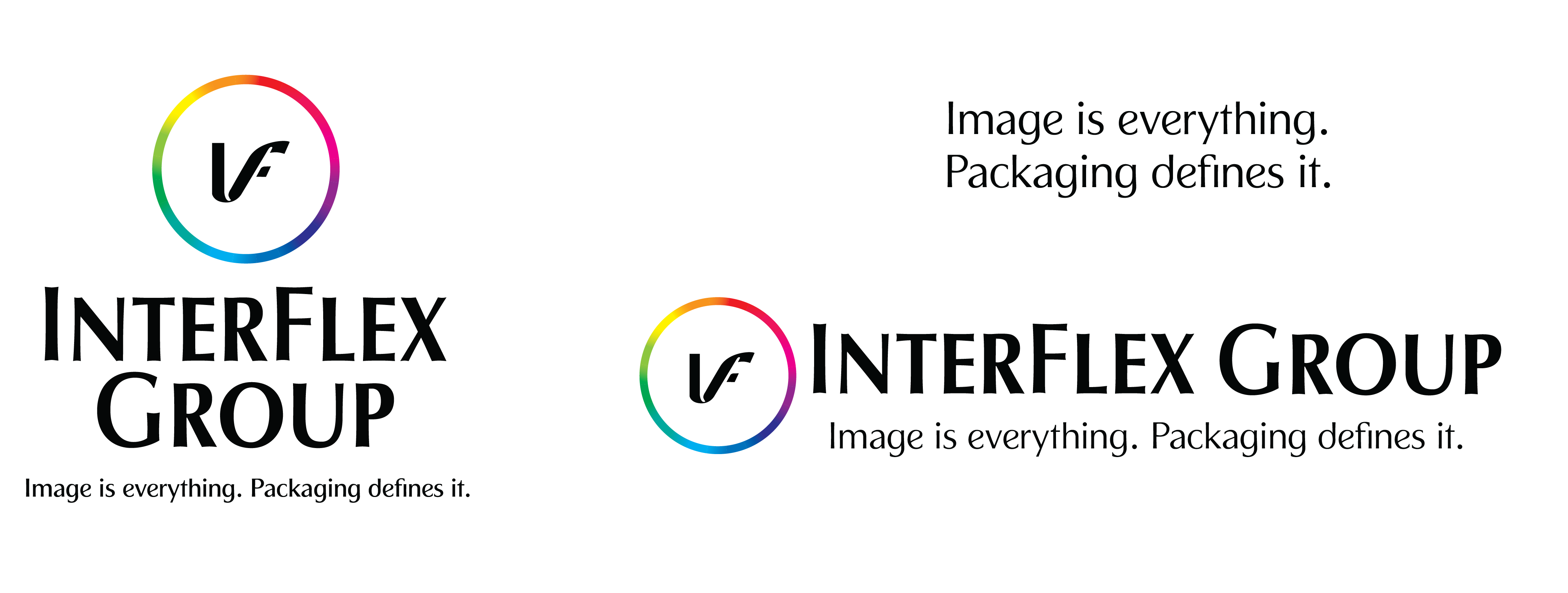
- Tagline text minimum height, when used alone, is 1/4″
- Minimum logo heights with tagline: vertical logo – 1″, horizontal logo – 1/2″
Download the zip files below.
Incorrect Logo Usage
Do not alter the InterFlex Group logo in any way.
Do not animate, color, rotate, skew, or apply effects to the logo. Do not separate the elements. Never attempt to create the logo yourself, change the font or alter the proportions.
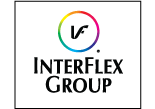
Do not reproduce visual identities
with frames or borders.

The logo should not be
manipulated, stretched, distorted,
cropped, or altered in any way.

Do not apply any visual effects.
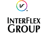
Do not alter proportions. All
elements should remain
proportional to each other.
Do not rearrange logo elements.
Color
IFG’s primary color palette consists of black and white, with blue accents as needed. Consistent color use strengthens our brand identity. The rainbow circle is a signature element for our logo and brand and should be the first choice unless the logo is backed up against a solid color, in which case using the monochromatic colors are acceptable and preferred.

True Black
R,0 G,0 B,0
C 75, M 68, Y 67, K 90
#000000

100% White
R,255 G,255 B,255
C 0, M 0, Y 0, K 0
#FFFFFF

IFG Cyan Blue
R,0 G,174 B,239
C 100, M 0, Y 0, K 0
#00aeef
Font Type
IFG’s primary typeface to use in conjunction with our brand and logo is Calibri. Commitment to this typeface will create a consistent and strong identity. The full Calibri family can be used in any of the available weights.
This is Calibri regular, italic, light, light italic, bold, bold italic
Please direct questions about use of the IFG logo to Marketing. All external IFG communications must be approved before release. Email info@www.interflexgroup.com for approval.
InterFlex Group Brand Guidelines – Issue v1.0, published October 2020
